Meals on Wheels Form
Problem: The goal of this exercise was to create a form for the Meals on Wheels service, and using common UI patterns to make it easy to use.
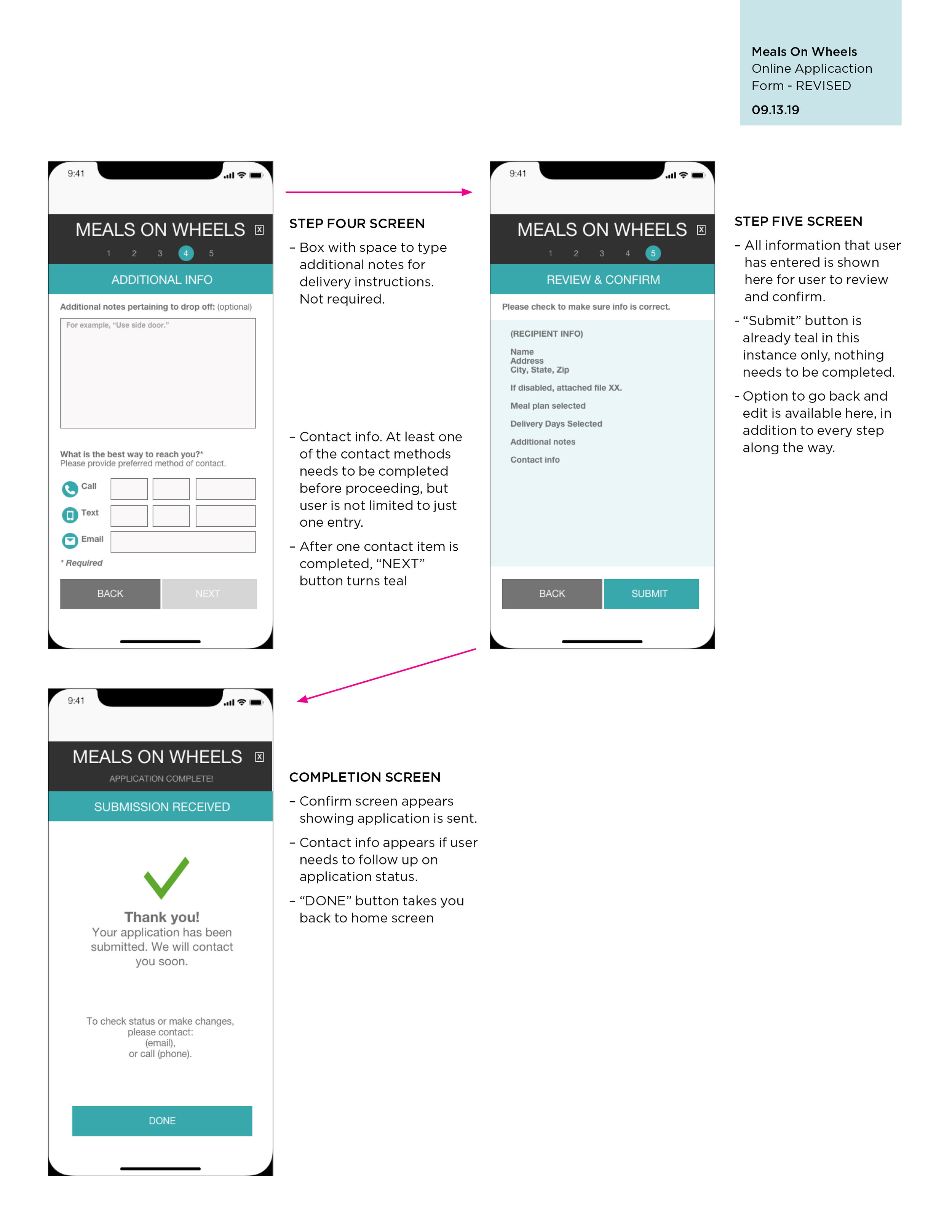
Action: I created wireframe sketches to identify a workflow to illustrate how the form would be completed on a mobile device. I had to also take into consideration the possible physical limitations of the user, given the nature of the form (large touch targets, for example). More detailed notes on my thought process are below the images.
Results: An annotated sketch shows the workflow and functionality of the form in a mobile platform. Common UI patterns, such as progress indicators and confirmation screens are also shown.
Learning: This was a valuable to exercise for creating clear information and stepping through a linear process. Additional consideration of the target audience was also a part of this project, making the assumption that they may potentially have vision or mobility impairments that would directly affect how they filled out this form on a mobile device. However, after studying accessibility during my coursework (which was after this assignment, for the record) I have gained a better understanding of how to approach similar usability problems.


My overall goal for this project was to make this form clear, easy to navigate, and quick to fill out with minimal opportunities for error. To achieve this, I did the following:
I put a breadcrumb trail across the top to indicate progress and to make it clear to the user the number of steps.
The “X” to the right of the header allows user to cancel out of application process at any point.
The page header is shown in the teal bar at the top of the page so the user can easily identify what section they are in.
The buttons are large throughout the application for ease of use. I am basing this on the assumption that the individuals in need of this service may be elderly or have disabilities. Large targets allow for less precision.
In addition to large targets, I wanted it to be very clear which items were selected, so the buttons change to a bright teal color when selected. This would help with visual clarity.
The “NEXT” button changes state from a light grey to a bright teal to indicate to the user that all the requirements have been met to proceed to the next step. This is done to potentially minimize the chance of error. If requirements are not met, the button remains in the light grey and is not clickable to denote incomplete information. Any required items are marked.
I have included an option to upload disability documentation, or take a picture of it. The goal here is to give the user multiple options to achieve one task.
Lastly, a confirmation screen shows all the info that has been provided to give the user a chance to review before final submission. If anything is incorrect, they have the option to hit “BACK” and correct. Again, aiming to minimize the chance of error. A confirmation screen provides contact info for follow up, if needed.